The post-1990 stagnation in Japan has been much discussed, analyzed, and ballyhooed. Yet, comparatively little attention has been given to the other Axis powers, Germany and Italy, which are nearly equally stagnant (Italy more so, Germany slightly less). The reason is that Japan’s stagnation started earlier and then decelerated, while Germany’s and Italy’s started and accelerated later. Let us look at the RGDP/worker of these countries in relation to that in the United States (peak=1):
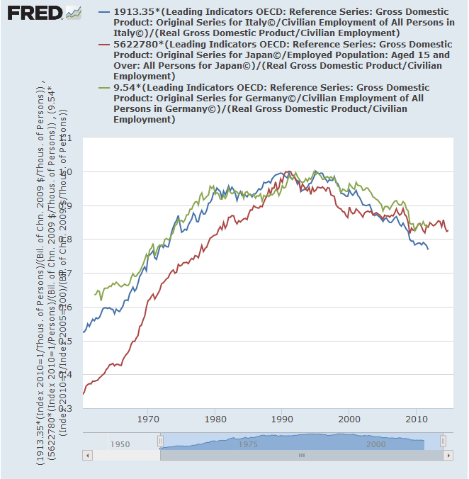
https://fred.stlouisfed.org/graph/?g=p4W3
Compare this to the same variable in, for example, Sweden:
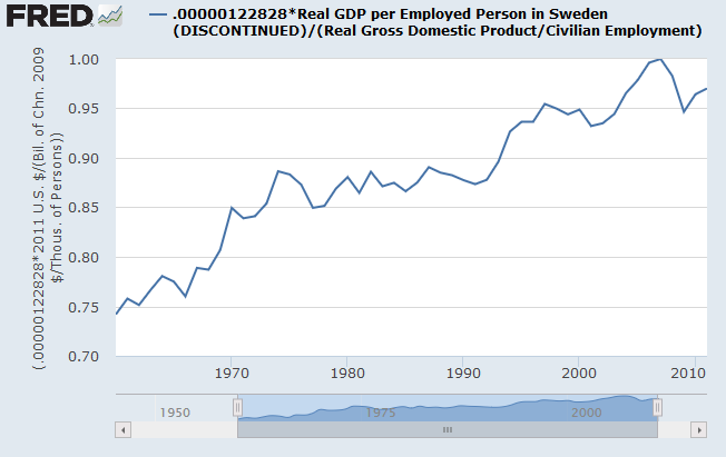
http://research.stlouisfed.org/fred2/graph/?g=1EMr
Basically, Sweden has little more than an exaggerated version of the U.S. trend. So what is going on in the Axis countries?
Whatever it is, it probably has nothing whatsoever to do with aggregate demand, and probably has to do with anything financial only on a tangential level. Since 1995, the highest rate of inflation among the Axis countries has been in Italy, yet it has had the worst stagnation. By simply glancing at inflation, it is clear that Italy only began to suffer unique aggregate demand problems in April 2013-precisely when Italy’s output per worker bottomed out! Also, as pointed out by Mark Sadowski, a huge (and successful) aggregate demand stimulus effort carried out by the Bank of Japan in 2012-2015 failed to significantly boost the rate of real GDP growth, while it did successfully boost the rate of nominal GDP growth.
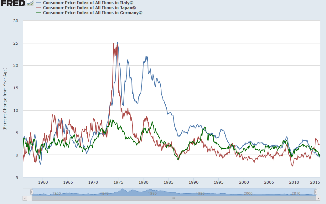
http://research.stlouisfed.org/fred2/graph/?g=1EV9
Thus, in Italy, anything that happened before 2013 was an aggregate supply crisis with rough parallels to that in Indonesia in 1997-8, disguised by a single currency combined with relatively tight European Central Bank monetary policy, combined with increasing malinvestment resulting from flawed European integration both before and during the Eurozone depression, as is evident from its falling behind Germany in its RGDP/worker precisely when its currency became pegged to the Euro. Indeed, it is clear that in Italy, hourly compensation has risen faster than productivity since at least 2000.
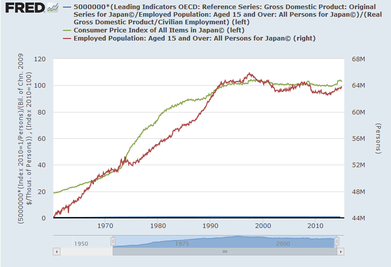
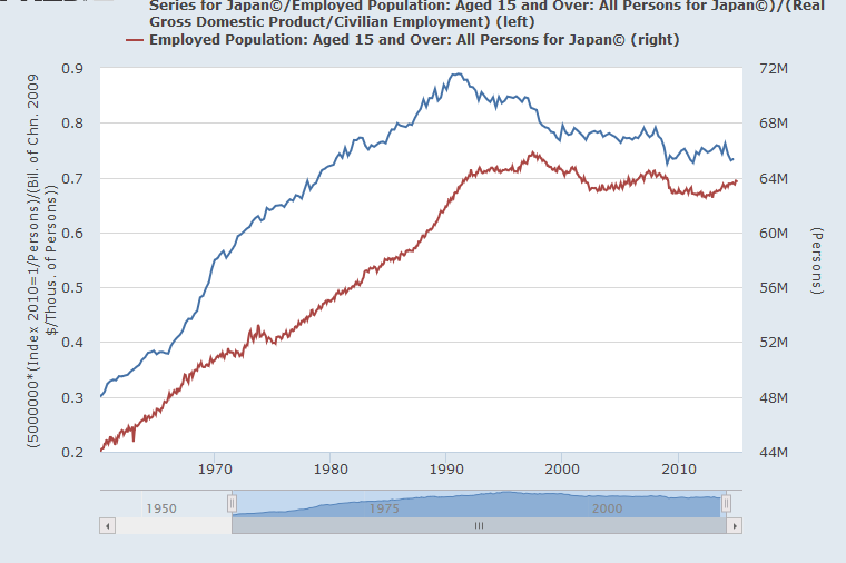
Speaking of 1997, it’s pretty clear that Japan suffered mightily during the crash, which fairly few people discussing the Japanese stagnation in broad terms have seen fit to mention. Sometimes, Japan’s suffering in 1997 is blamed on the sales tax hike, but this is nonsense, as the 2014 sales tax hike, which was even greater, led to a much, much tinier crash in RGDP per worker. Unlike the German and Italian stagnations, which have been more or less continuous, the Japanese productivity stagnation has taken place in three discrete phases, all coinciding with financial crises: the post-bubble period of 1991-1993, while the Yen was strongly appreciating, the 1997 crisis and aftermath in 1997-1999, when the Yen strongly depreciated, and the deflationary period of the Great Recession, Q4 2008-Q1 2009, when the Yen strongly appreciated. It seems to me that the simplest explanation for Japan’s stagnation is that each great financial crisis Japan suffers through hits its high-productivity industries hardest, leading them to shed jobs and lead Japan’s average productivity to regress behind the U.S. Also, that Japan ended its natural productivity convergence with the U.S. in or around 1990. The natural pricing powers of the free market don’t bring productivity back to U.S. levels in a process of reconvergence due to notorious Japanese protectionism, which keeps the Japanese export-to-GDP ratio smaller than that of the U.K., Palestine, Australia, Mexico, Russia, or the Philippines.
The famous correlations all too many people have in mind:
http://research.stlouisfed.org/fred2/graph/?g=1E1d
are little more than illusions. Japan’s productivity stagnation is not causally linked to its employment stagnation, and its CPI stagnation is not causally linked to its productivity stagnation. Had it had higher inflation, it would not have had higher growth. Had it had higher growth, it would not have had higher inflation. Had it had higher productivity growth, it would not (necessarily) have higher employment. Had it had higher employment growth, it would not (necessarily) have higher productivity.
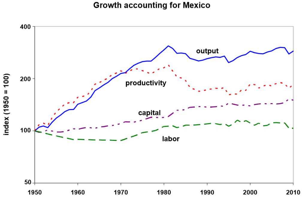
If it’s Japan’s population size which makes Japan’s stagnation such a disproportionate topic of discussion in the English-speaking world, then I know a country of 124 million people who’s productivity stagnation has been longer (by a decade) and much, much harder than that of Japan, and which is thousands of miles nearer to the U.S., and whose stagnation is much less discussed: Mexico:
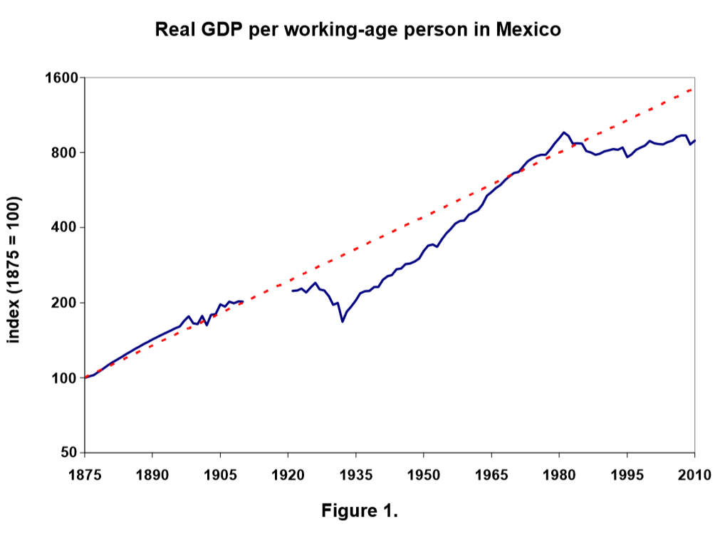
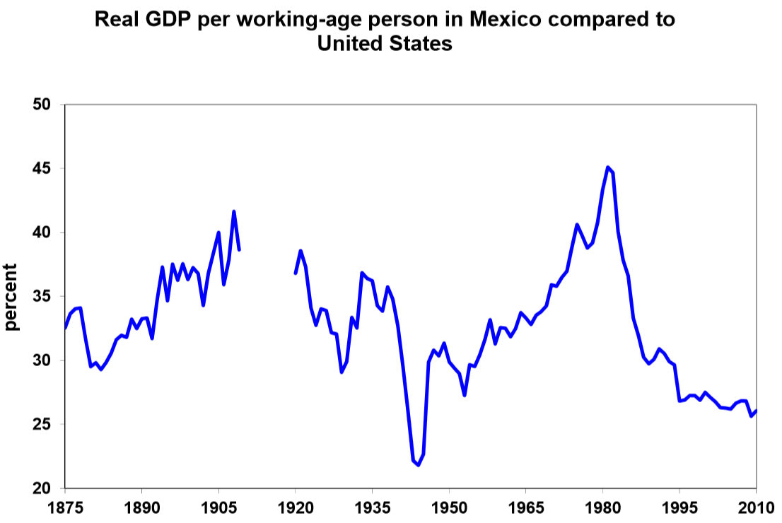
http://www.minneapolisfed.org/research/wp/wp69
Click to access MGI_Mexico_Full_report_March_2014.ashx3.pdf
But why does the former Sick Man of Europe and the present Healthy Man of Europe, Germany, have a similar history of GDP/worker rise and stagnation as Italy, only milder? From the data, it seems that Germany has been holding on to manufacturing jobs harder than the United States. My first thought was guessing working hours fell harder in Germany, but that turned out to be precisely the wrong explanation. The idea that Germany’s falling behind the U.S. in output per worker is due to different labor market fates in these countries is contradicted by a lot of the German productivity stagnation taking place before Germany’s labor market sclerosis began to subside in 2005. So my present guess is that Germany has been falling behind the United States due to its failure to move quickly from manufacturing into high-value-added services. Perhaps most of the Axis productivity stagnation can be explained via three factors: over-reliance on high-wage manufacturing, insufficient labor market churn, and an aging, more risk-averse working population.
It now seems time to give some charts of the labor force sizes of the Axis countries, as well as that of the United States:
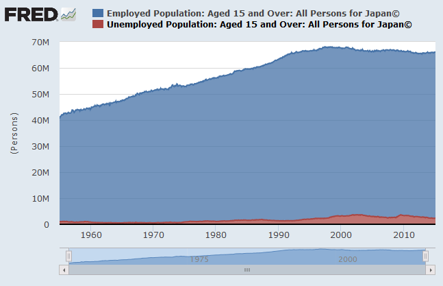
http://research.stlouisfed.org/fred2/graph/?g=1Erx
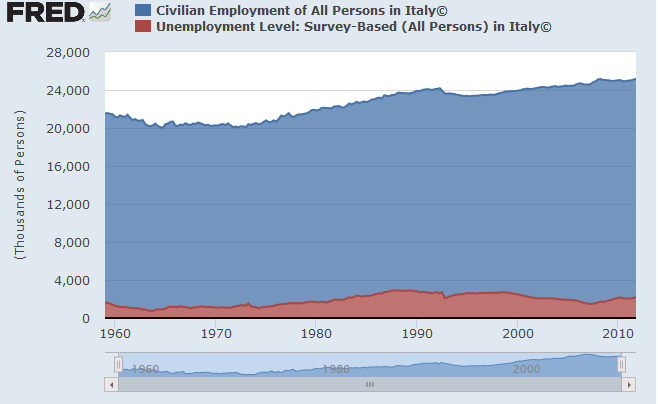
http://research.stlouisfed.org/fred2/graph/?g=1Ers
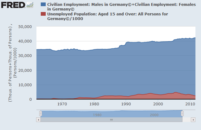
http://research.stlouisfed.org/fred2/graph/?g=1Eu7
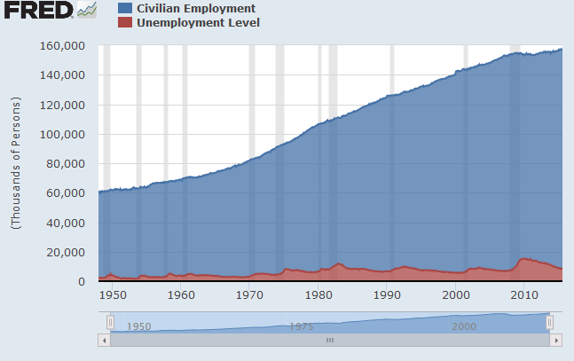
http://research.stlouisfed.org/fred2/graph/?g=1FUm
Nothing here to clearly relate to productivity differences. Aw, well.
From these charts, it seems clear that variation in unemployment rates between countries really is mostly a structural issue, not one related to the rate of growth of the size of the labor force.
